Monday, September 30, 2013

Still Playing Catch Up over at The Craft Barn

J is for Joker


Getting there slowly, just a few more to catch up on.  My choice of word for the letter J is Joker.  I covered the pages with harlequin and gold tissue papers then made three tiny ATC sized envelopes, embossed at the top and lined with gold tissue paper for the tiny Joker cards.  the image on the right I layered on the contrasting paper to match after embossing the edges with gold.  Sticker letters and the dictionary entry finish the card.  Please take a few moments to check out my other catch up letters below.  Link to the challenge can be found HERE

Off to enjoy the other posts, thanks for looking and comments and suggestions are always welcome.


T is for Tulip


The tulip is one of my favourite flowers, it heralds Spring with such vibrant colour.  To echo this I used Gelatos for a dripped background on gesso.  Stamps and stencils remove and add colour to the pages.


Y is for Yurt


The letter over at the Craft Barn is Y with some yellow on your page.  I chose the word Yurt.  Sprayed glimmer mist through stencils background.  Texture paste spread through leaf stencil and painted black then highlighted with Viva paste.  Window cut through several layers to reveal the inside of a yurt.  On the outside of the window is another photo of a yurt.


B is for Bathing Beauties, Beige, Black, Border, Brown, Brownie

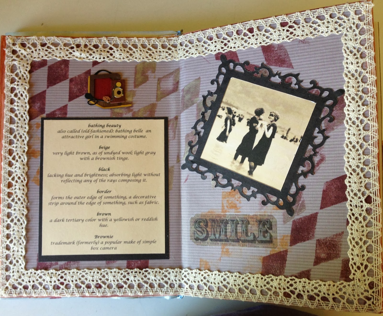
Beige brown striped paper background, harlequin stamp, Edwardian girls at the seaside photo with black die cut border.  A cardstock sticker of a Brownie box camera and a rub on word.  All with a lace border.

Tuesday, September 24, 2013

Christmas Cards - Step

Finally got round to making a few of my Christmas cards.  I bought a Cutz Mountain Lodge die last January in the sales and this is the first project I have made with it.  On the left side I embossed the white cardstock with a holly embossing folder and coloured the berries with bright red stickles.  On the right side I frosted the trees, the background stamped cardstock and mountain lodge diecut with crystal glitter.  


From the side it looks like this, instructions for the construction of the card can be found on Youtube.


 I made a couple of alternative cards using blue and white cardstocks, each one is pretty in its own right but I much prefer the black and white version.


Wednesday, September 18, 2013

Craft Barn Dictionary Challenge Catch-up

G is for Gable

 
Sorry for my long absence, so many letters to catch up on, had my hip replacement and been to England to stay for 6 weeks with my daughter and my grandsons, oh what fun we had.  To continue on with my altered dictionary challenge over at The Craft Barn Blog HERE for the letter G I have painted a watercolour of a barn showing the gable end.
 
If you have time please look at my other letters below that I have finished so far, still got a few more to go but on my way. 

 
U is for Urban Decay
 
 
Seen to much these days, I found this photo of what was once a splendid building.  So far I it has not been painted with graffiti, so I added some of my own.  My first ever attempt at this art form, and believe me it is not easy. 
 
 
F is for Ferruginous
 
 
The colour of iron rust.  Acrylic paints in black, rust red, yellow and orange brayered onto Tyvek and stuck to the pages to make the background.  The same colours used to stencil across the bottom of the page.  Two pockets torn from the painted Tyvek on the right side hold tags of red headed girls and the main picture on the left is matted onto blue cardstock and edged with gold marker.
 
K is for Knot


Love this photograph on the right of rope knots had to use it.  6 knots tied with cord and mounted on cardstock.  Tried to get a nautical feel to the pages with the use of red, white and blue colours.
 
A is for Aquarium
 
 
Two zipper plastic bags filled with hair gel and placed on a mixture of blue sprayed background with stamped fish and ferns.  Frames of cardstock hide the edges of the bags.  The cheaper the hair gel the more bubbles you get in it.
 

W is for Wall


I removed a piece of from the keyboard of my computer which made a perfect stencil for the wall.  First coated pages with gesso, printed a picture of poppies in a field (circle heads) and stuck it to the pages.  Cut 3" circles from cardstock to mask the "hole" and masked an inch strip along the top with paper.  Another coat of gesso over the whole page, let it dry.  Keyboard mask down sprayed with watered down ink. Flower stamps coloured with Twinkling H2Os.

R is for Robin's-egg Blue


  I chose Robin's-egg Blue for my letter "R".  I used my water soluble oil pastels for the background, nest and eggs.  Stamped an American Robin in brown Stazon ink and coloured it in with the oil pastels too.  Die cut silhouette letters on robin's egg blue speckled paper backgrounds (though you can't see the paper clearly in my photo) finish my page.